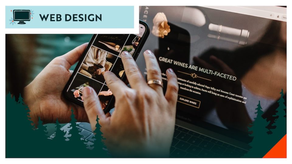
Tourism is a competition. Every destination is fighting for the same traveler's attention, their limited vacation days, and their discretionary income. And for the most part, that competition plays out online, before a visitor ever sets foot in their town. We spent three days at the North Dakota Travel Industry Conference in Grand Forks, a room full of people who think about this every day. DMO directors, resort operators, state tourism marketers, park managers. The conversations were good and one theme kept surfacing.
The destinations winning the attention battle aren't always the ones with the most to offer. They're the ones who figured out how to show it online.
After twenty years of building websites for tourism organizations, resorts, and destination marketing organizations across the upper Midwest, we've seen the same patterns repeat. Here's what separates the websites that drive visits from the ones that don't.
The Website Is a Brochure, Not a Booking Tool
The most common thing we see on tourism websites is a wall of information, beautifully organized, with no clear next step.
A great destination website has one job for every type of visitor. A potential guest should know exactly how to start planning their trip within ten seconds of landing on the homepage. A planner or DMO partner should be able to find contact information and resources without hunting. A media contact should find a press kit without asking.
DIY Audit:
Land on your own homepage and try to complete each of those actions. Time yourself. If any of them takes more than 30 seconds, there's a structural problem.
Stock Photography That Could Be Anywhere
We can spot stock photography on a tourism website from across the room. So can your potential visitors, even if they can't articulate why something feels off.
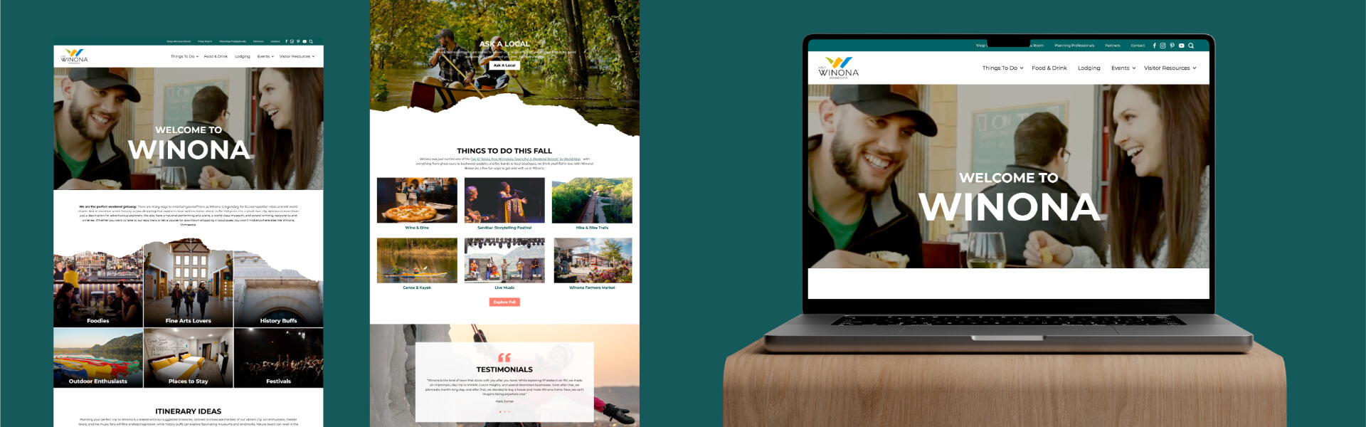
When we redesign tourism websites, like Discover Jamestown and Visit Bemidji, we make a firm decision to use no stock. Everything on the site shows the actual place, actual activities, actual adventure, and actual events for that community. The result is a website that feels specific to the town in a way that stock imagery never can.
Your destination is specific. Your website photography should be too. Original imagery is not a luxury for tourism organizations — it is the product.
Mobile Is an Afterthought
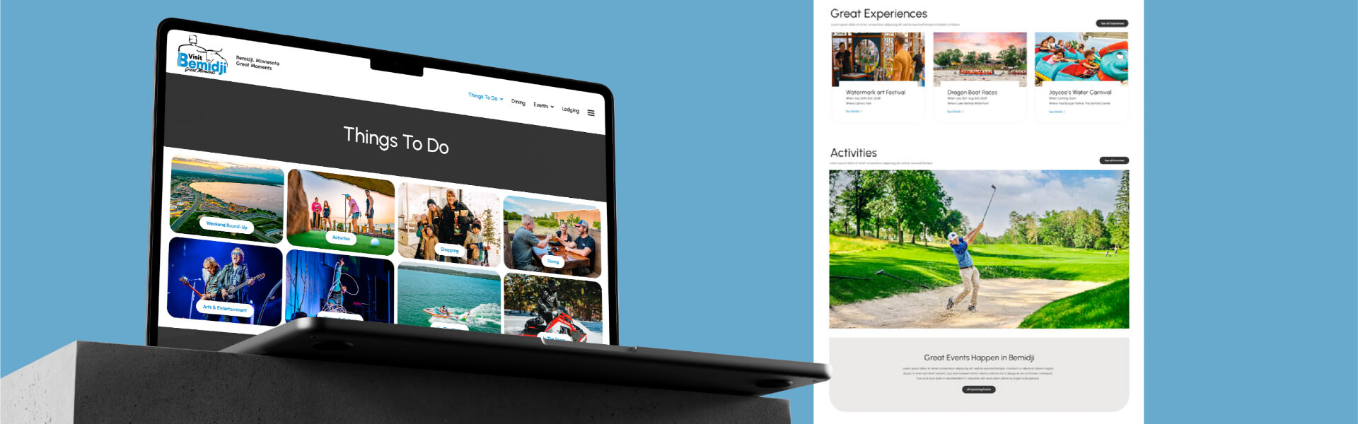
More than 60% of destination searches happen on a phone. The traveler who sees your destination mentioned on social media, gets curious, and taps through to your website.
If your mobile experience is a scaled-down version of your desktop site rather than a purpose-built mobile experience, you're losing that visitor at the moment of peak interest. Slow load time, cramped navigation, contact buttons that don't click-to-call. All of it creates friction at exactly the wrong moment.
The Brand Doesn't Match the Experience
We've visited a lot of destinations that are genuinely remarkable and then looked at their websites and wondered if we had the right place.
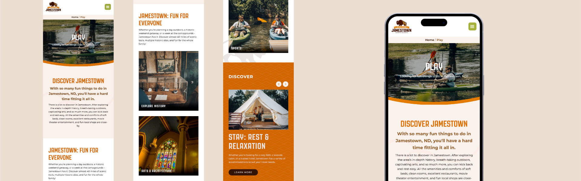
Brand consistency is not about aesthetics. It's about trust. When the visual identity, the photography, the tone of the copy, and the digital experience all feel like they belong to the same place, a visitor's confidence grows. When they feel mismatched — a dated logo, inconsistent colors, generic stock imagery — doubt creeps in.
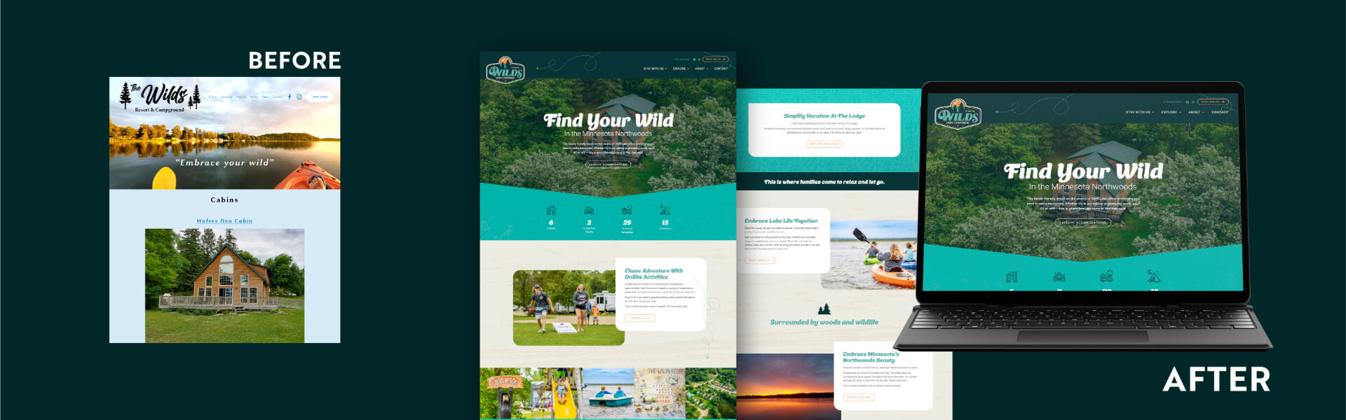
Our clients over at Wild's Resort had seventy-five years of history and a loyal guest base. Their brand and website had not kept pace with the quality of the experience they were delivering. We conducted a rebrand and redesign for them and what we did wasn't just cosmetic, it reinforced the visitors' trust.
What the Best Tourism Websites Do Instead
The strongest tourism and DMO websites we've seen share a few common traits:
- OBVIOUS: They make the next step obvious. A clear booking or trip-planning CTA above the fold, on every page.
- ORIGINAL: They use original photography that is specific to the place, guests, venues, and experiences.
- FAST: They load fast on mobile and work just as well on a phone as on a desktop.
- IDENTITY: They have a visual identity that reflects the personality of the destination - not a generic template.
- INTEGRATE: They integrate with the tools visitors actually use: online booking, Google Maps, social platforms.
A Note on the North Dakota Travel Industry Conference
Grand Forks was a good reminder of what we already knew: the communities investing in their digital presence are the ones growing their visitor numbers. It's not a coincidence.
If you're a tourism organization or DMO in the Midwest and your website isn't reflecting what your destination actually offers, we'd like to help. Connect with us today to learn how we can help improve your website.